Opa
About the school
Opa! is one of the main schools of Design in Fortaleza and, since 2007, seeks to "supply the market's needs, with an approach focused on the realization of graphic products based on theoretical foundations and on applying, in practice, the concepts learned in the classroom".
The reason this is one of the most pleasant projects is because Opa! is part of my career as a designer.
Layout
It was not hard to start a design school project. The branding elements of the school were already well defined and all the stationery material served as a source of inspiration for the page.
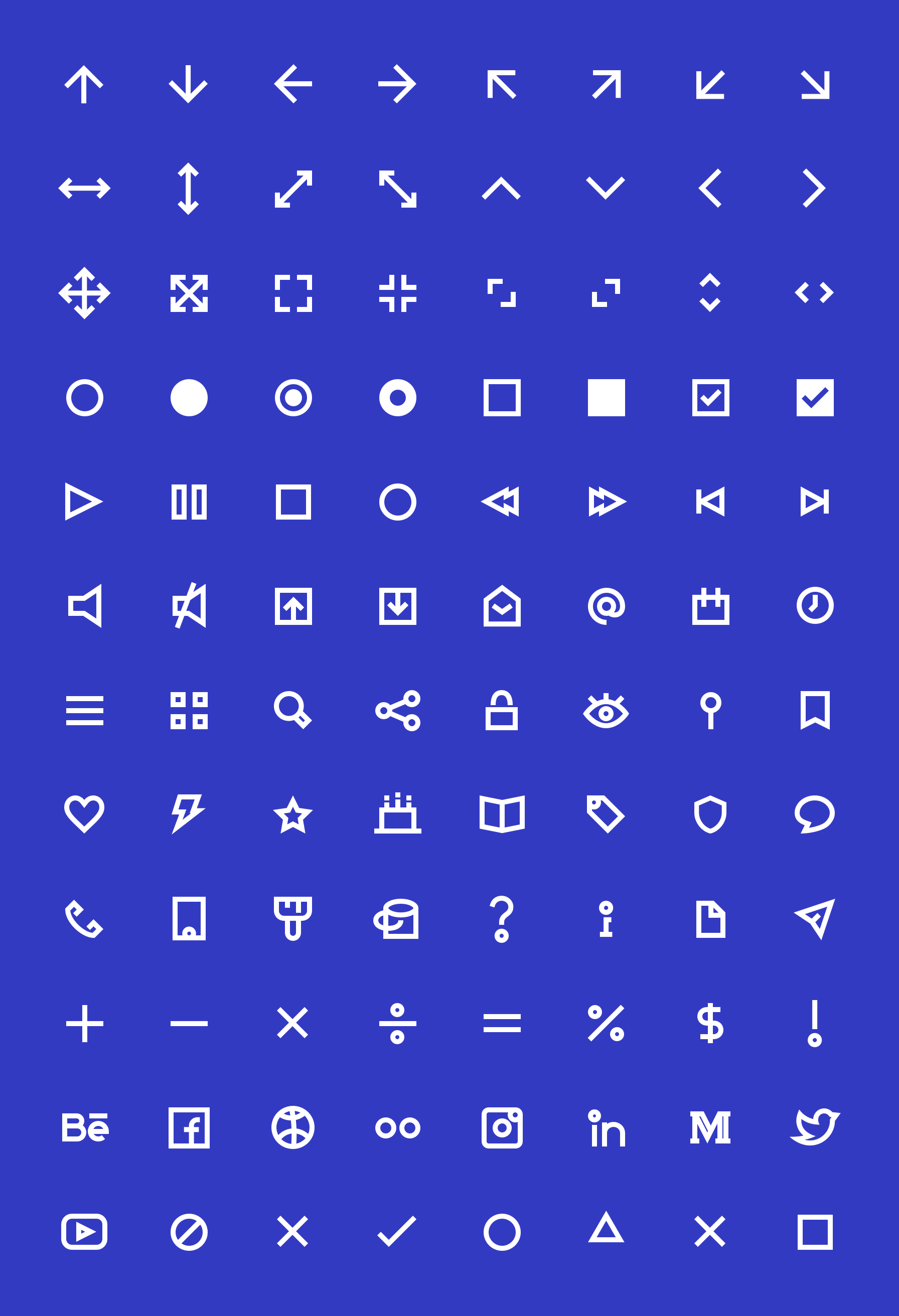
Speaking about source of inspiration, Avenir is a fundamental part of the project, since it guided the creation of the website's icons. The typographic family, which, although not purely geometric, has little contrast and greatly favored the construction of a minimalist design.
The main page, and the first to be explored, was the courses page. Dirceu Ximenes and Alberto Gadanha, owners of the school, defined some requirements and told me a little bit more about their expectations for the page.
Some of the considerations below:
- In general, the courses have a dense program and therefore the sections would have to facilitate access to the content;
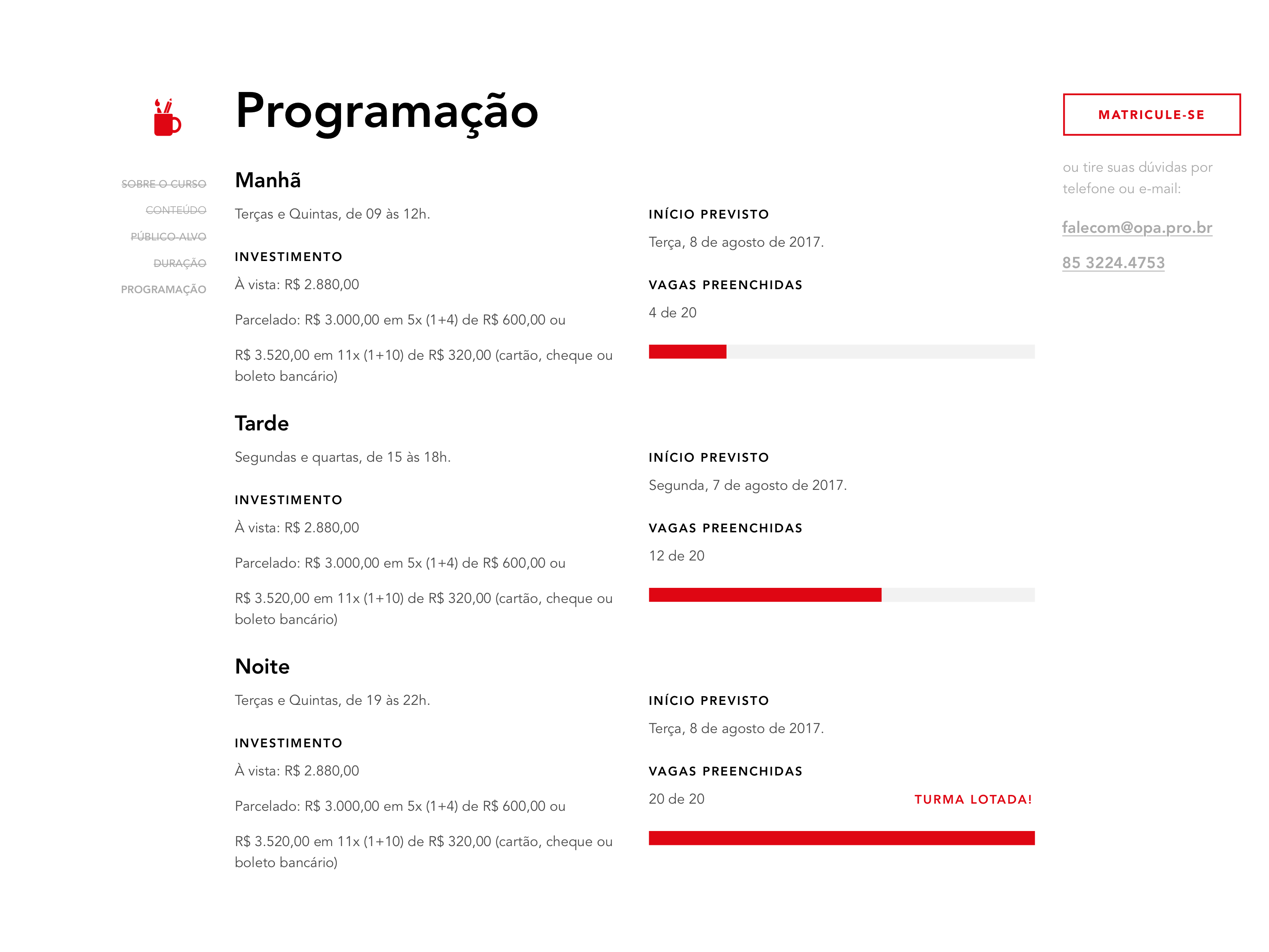
- There may be 1 or more classes per course;
- Information on start, time, price and payment methods are related to the class.
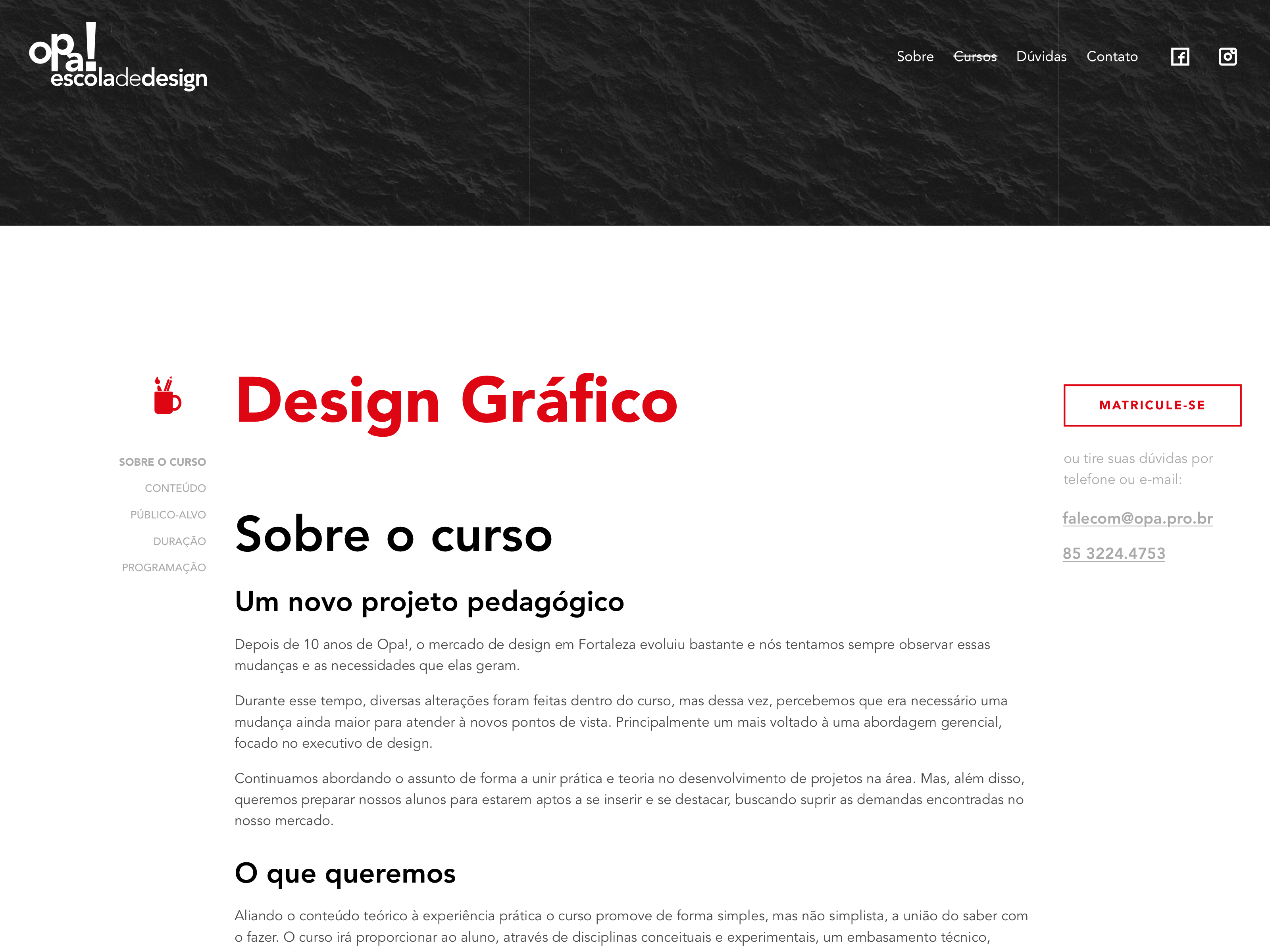
As vacant posts in the courses are limited, I decided to place a vacancy counter for the programming section so the sense of urgency could be explored.
Taking advantage of the greater space available on large devices, I created sidebars for internal page navigation and quick access to contact information.
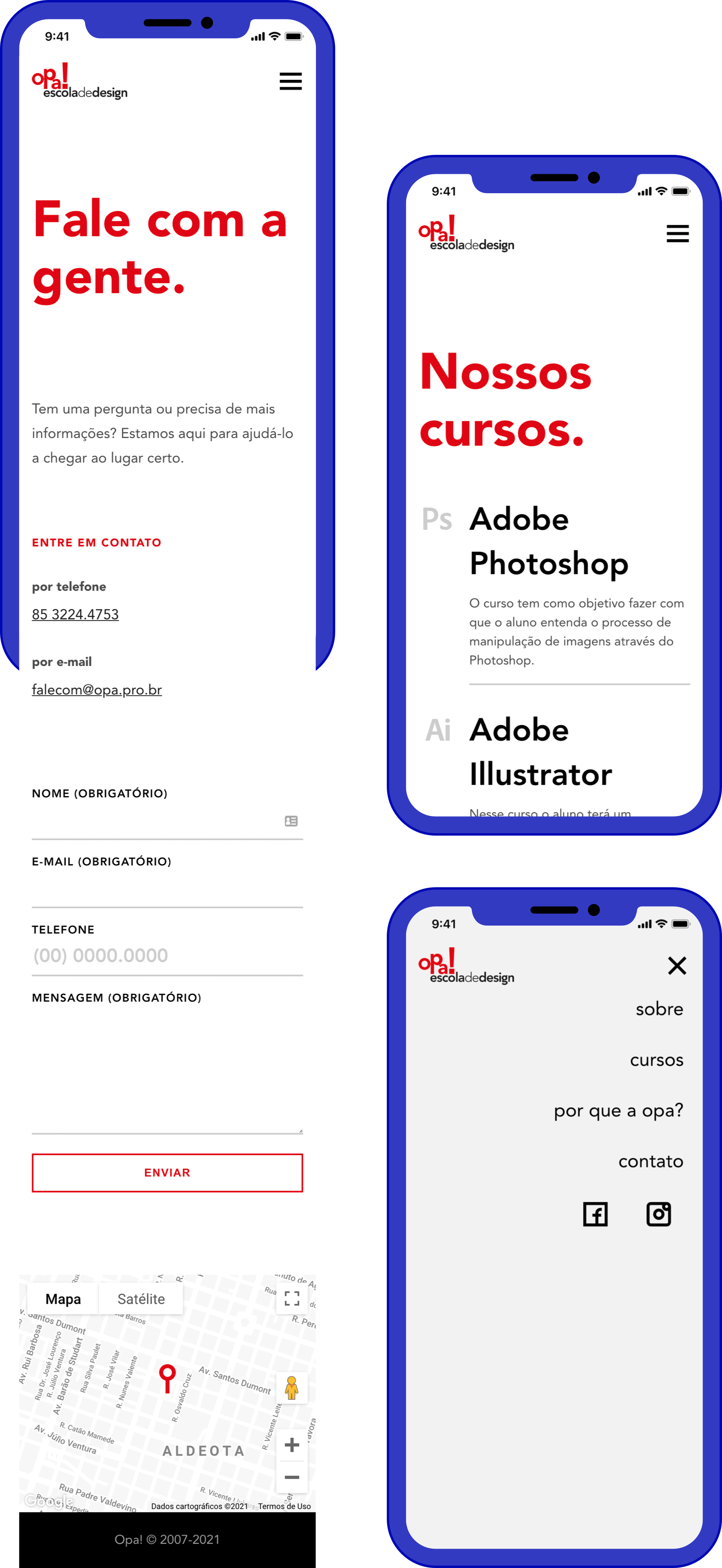
Icons
In order to add even more personality to the project, I developed a set of icons to relate to the proposal of minimalist and geometric design of the page.
Development
I was responsible for creating an end-to-end project, so the development phase represented my personal development in the programming.
The entire site was built to work with a CMS in order to give autonomy to the school staff and that is why we opted for Wordpress - due to the wide and practical use, and the robustness of the plugin library.
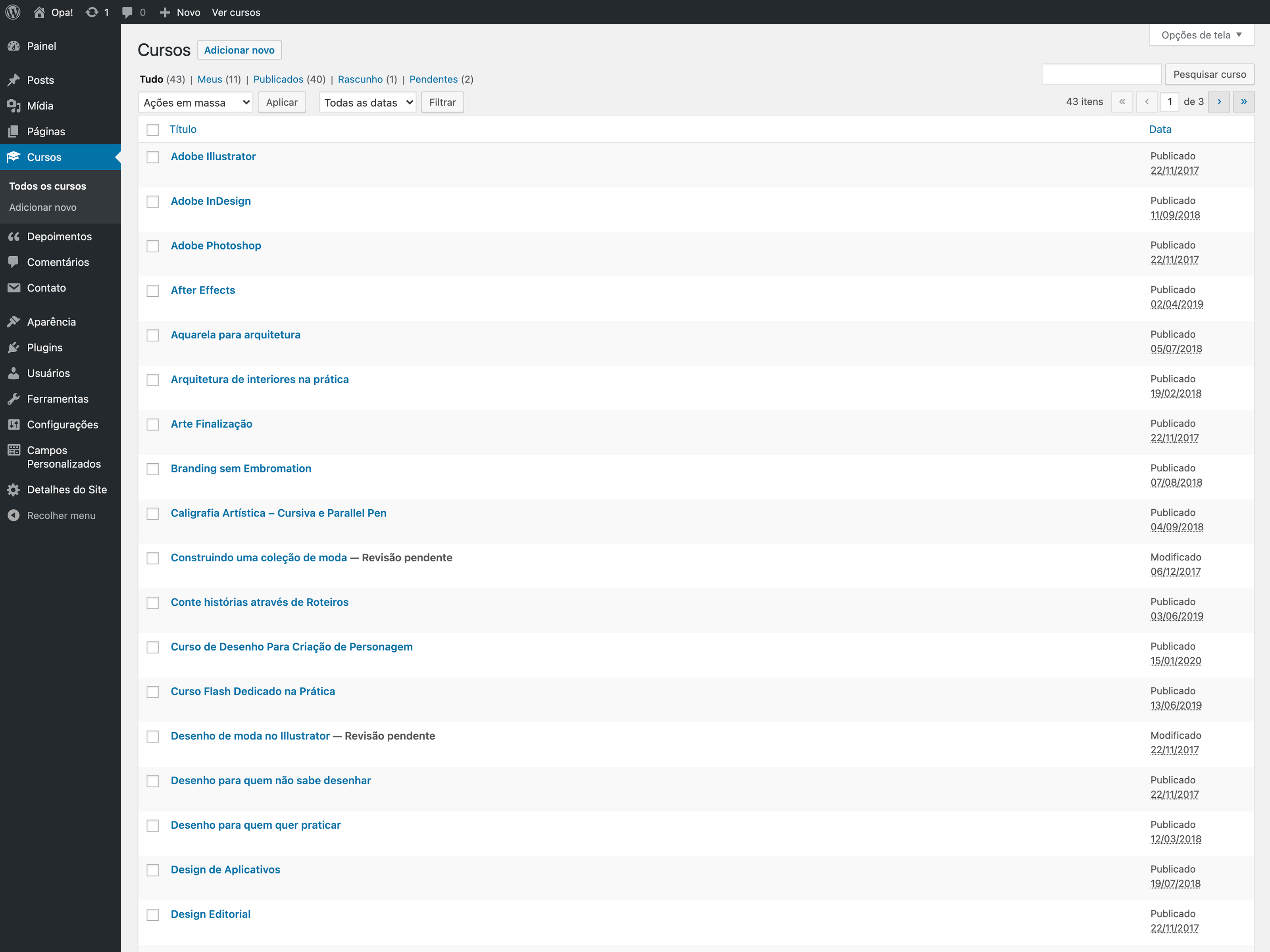
Even after 5 years, the site remains functional and meets the needs of the school.
Company
Opa! escola de design
Project year
2017